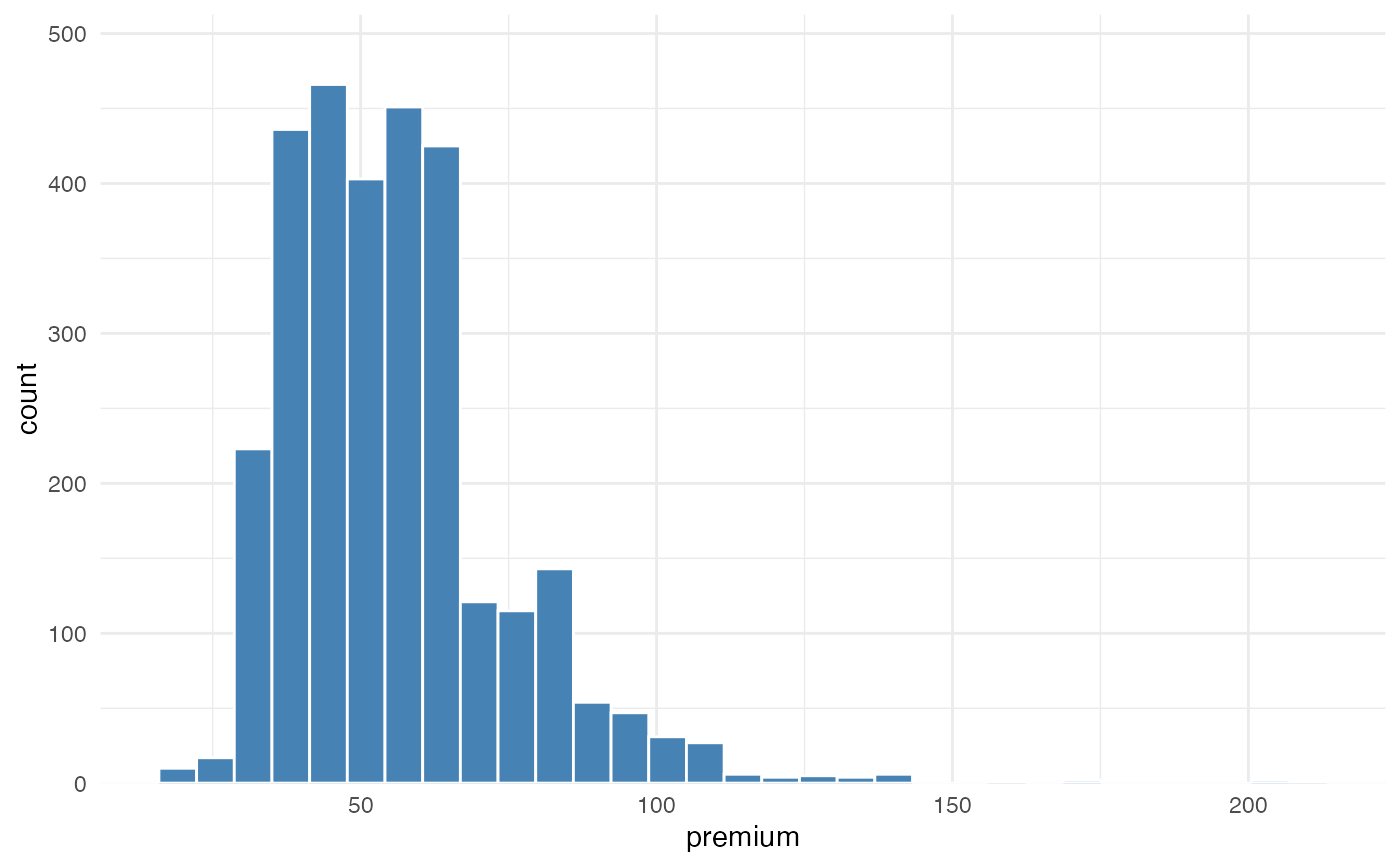
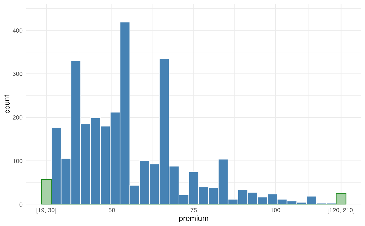
Visualize the distribution of a numeric portfolio variable while keeping extreme tails readable.
Insurance portfolios often contain skewed variables such as claim amounts,
premium, exposure, insured sums, deductibles, or fitted premiums. A few very
large policies or claim events can stretch a regular histogram so much that
the body of the portfolio becomes hard to inspect. outlier_histogram()
keeps the main range visible and groups values below lower or above upper
into dedicated tail bins.
The plot is useful for actuarial portfolio checks, data quality review, and model preparation: it helps show where most risks are concentrated while still making the presence of extreme observations explicit.
Usage
outlier_histogram(
  data,
  x,
  lower = NULL,
  upper = NULL,
  density = FALSE,
  bins = 30,
  bar_fill = "#E6E6E6",
  bar_color = "white",
  tail_fill = "#F28E2B",
  tail_color = "white",
  density_color = "#2C7FB8",
  left = NULL,
  right = NULL,
  line = NULL,
  fill = NULL,
  color = NULL,
  fill_outliers = NULL
)
Arguments
- data
A data.frame containing the portfolio variable to inspect.
- x
Character; numeric column in
datato plot.- lower
Optional numeric lower threshold. Values below this threshold are grouped into one left-tail bin.
- upper
Optional numeric upper threshold. Values above this threshold are grouped into one right-tail bin.
- density
Logical. If
TRUE, add a density line. Default =FALSE.- bins
Integer. Number of bins used for the displayed range. Default = 30.
- bar_fill
Fill color for regular histogram bars.
- bar_color
Border color for regular histogram bars.
- tail_fill
Fill color for tail bins.
- tail_color
Border color for tail bins.
- density_color
Color for the optional density line.
- left, right
Deprecated aliases for
lowerandupper.- line
Deprecated alias for
density.- fill, color, fill_outliers
Deprecated aliases for
bar_fill,bar_color, andtail_fill.
Value
A ggplot2::ggplot object.
Details
This function is intended as an exploratory portfolio diagnostic. It does not
remove or winsorize observations in data; it only groups tail values in the
visual display. The labels on the tail bins show the original range captured
by each tail bin.
The method for handling outlier bins is based on https://edwinth.github.io/blog/outlier-bin/.